Aesthetic, intuitive, clearly structured, light-weight just like a cloud. This is how it should feel like for you using Stackfield. And that's what we keep in mind with each of our updates, because we want Stackfield's wide range of features to make your work easier, not more complex. We're sure that in many ways the platform's usability is more important than the features themselves. That's why we are constantly working on improving the user experience, as we are doing with the following update:
Reactions
The public response to our sticker update in September proved that what seems so trivial and unimportant is by no means trivial and unimportant. Our users loved our home office sticker set and even asked for more. Why? They prevent misunderstandings, make written communication become clear and unambiguous and they make everyday work more fun. After all, work life takes up most of our day. So why spend it all the time crimson-faced and narrow-eyed?
So after we had our stickers, we thought of new things to brighten our work days. Today we can introduce our new reactions.
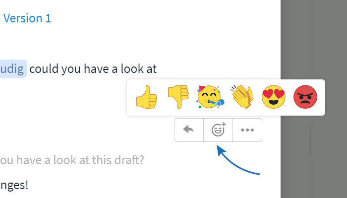
In addition to a simple "Like", you now have five more emotions at your disposal that you can use to react to messages from your colleagues. You can access them by clicking the emoji icon that appears when you mouse over the message. A great and important side effect: in many cases they can replace a written response, thus preventing your message stream from losing focus.
I have to admit, we couln't go entirely without "crimson-faced and narrow-eyed" emotions. Though, it’s better for them to be only part of our reactions than becoming a real-life expression of yours, right?
Enhanced preview for image files
On Stackfield you can attach files to any type of item, whether it's a task, discussion, page, other file or event. Until now, the files were displayed in the comments with a size of 50 px. In some cases, however, this was too small to be able to tell what file it was.
With our update we have increased the preview to 300 px thus making it six times the original size.
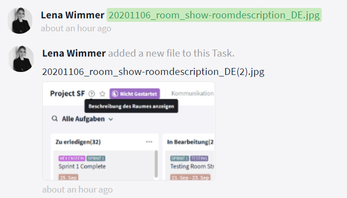
In future, you won't have to open the preview of the files one by one to find the right one.
Separate listing of mentions in "My week"
Notifications on messages that particularly mention you are important because your team members use them to reach out to you directly, to get feedback as soon as possible or to let you know that the information is relevant to you in particular.
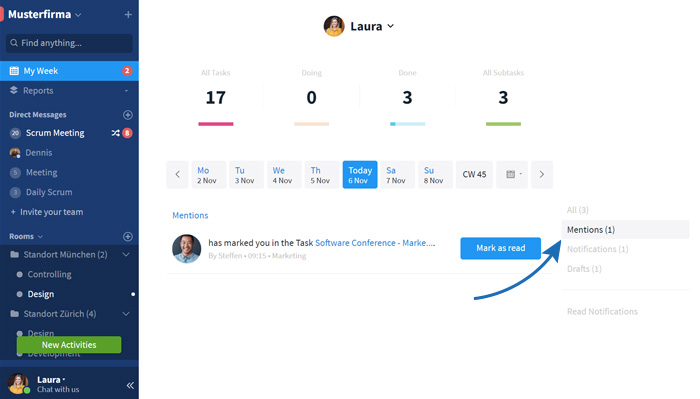
Previously, this kind of notification was listed alongside all other notifications within your "My Week" section, making it easy for them to get lost, especially when there are a lot of notifications. From now on, mentions will therefore be listed in a separate section within your "My Week" view.
Direct messages from other organizations
This new feature is relevant for Stackfield users who are part of multiple organizations. This can happen, for example, when large corporations create multiple organizations for different locations or teams within their Enterprise Plan, or when collaborating with external organizations.
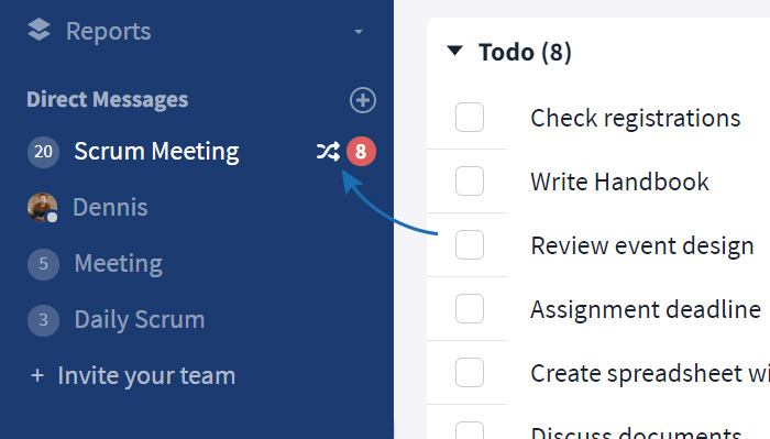
To prevent these users from having to constantly switch between organizations to check for new messages, Direct Messages will appear in the sidebar in general, regardless in which organization they were received. A crossed-arrow symbol will indicate, that the message originates from another organization.
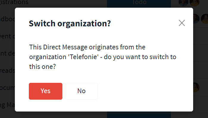
Clicking on the message opens a dialog box that informs the user which organization the message originates from and that directs the user to the respective message in this particular organization.
Quick access to room description
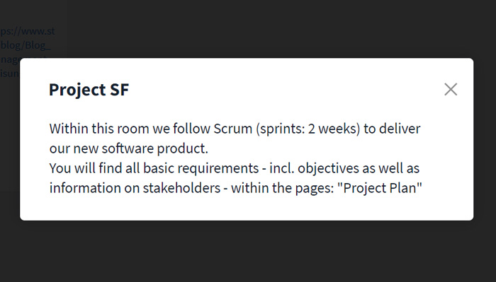
Within the room settings, Room Admins have the option to enter a description with all important information regarding this room. This can be information on the function of the room, instructions for collaboration within the room, or simply basic information on the topics covered.
In many cases, room members need to regularly call up the room description, which is why we decided to provide a quick access to it directly from the room header. There is no need to first open the room settings anymore. A click on the question mark symbol to the right of the room name is sufficient.
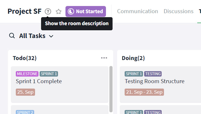
The room description will be shown within a small overlay window.
Now, this update is meant to be a polish update, that is supposed to increase the usability of some functions and to make the user interface even more appealing. We are looking forward to your feedback and will start right away to work out the features for the next update.
Almost finished...Please click the link in the email and confirm your email adress to complete the subscription process.
Never miss a post. Get awesome insights in your inbox.